Competitive Analysis Competitor Identification

Competitor Identification

In order to understand the current landscape of the e-commerce arena, we did a competitive analysis with major players in high-end online retail and fashion blogging. We took a look at a diverse array of features on their site to identify what makes them successful in converting and retaining their consumer base. These features ranged from basics like landing page to interactive strategies like social integration and personalization.

Landing Page

Net-a-Porter

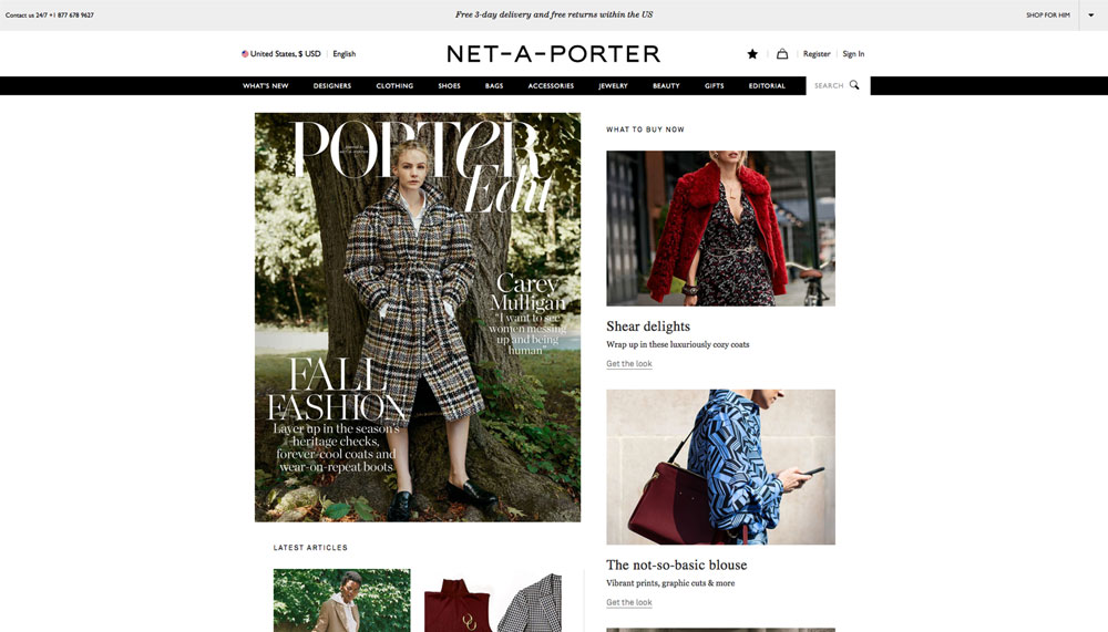
  • Layout evokes the feeling of reading a magazine

  • Many different stories live on the left hand side of the landing page and these stories are well categorized (i.e., What to Buy Now, Latest Articles).

  • Each story has a “Read & shop” button under the sub-headline.

  • A large cover story lives at the top left corner of the landing.

  • Collections of products live on the right hand side of the landing page.

  • Each collection has a “Get the look” button under the collection title.

  • Net-a-Porter live follows the stories at the bottom of the landing page and provides a constant live feed of what other users are currently buying on Net-a-Porter.

  • Users can access their brother site, MR PORTER, by clicking “SHOP FOR HIM” at the top right corner of the landing page.

SSENSE

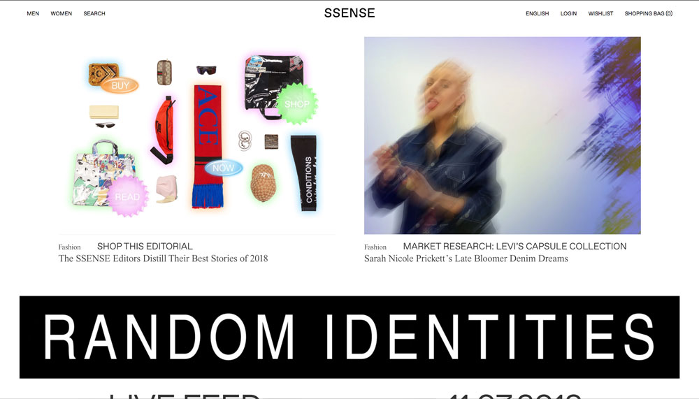
  • The landing page is dominated by fashion editorials written by the cool kid about hip style trends and hot new products that are linked to buy it directly from ssense

  • Each of the stories are accompanied with compelling photographs that are tagged with their respective categories (i.e., culture, music, featured, fashion)

Glossier

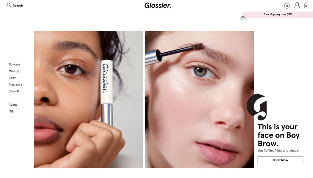
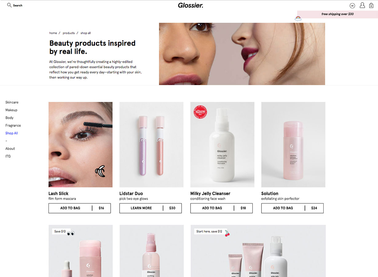
  • Product type navigation on the left side of the page

  • Hovering over a product type on the left navigation bar will open a panel with products within that category

  • Hovering over the products in that panel will show photographs of the product and models

  • Millennial pink products and compelling photographs in the A-spot

  • Hovering over the A-spot photos show randomized, delightful cursor icons

  • Clicking on the A-spot shows a delightful icon of a rotating planet

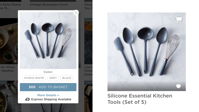
  • Makeup and skincare bestsellers are on the landing page with easy shopping workflow – users can select their shade and add items directly to their bag without leaving landing page

  • Company mission with icons

  • Reviews from top magazines

  • Embedded Glossier Instagram feed

Man Repeller

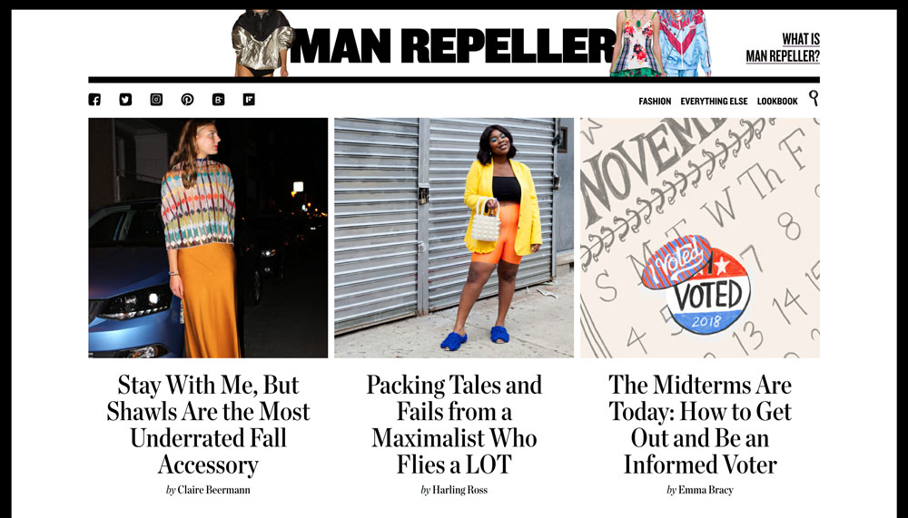
  • The It Girl, who is educated, well rounded and updated with the latest lifestyle news from fashion to food and beauty

  • Catchy sounding topics for articles that are highlighted with editor’s own picked photo

Goop

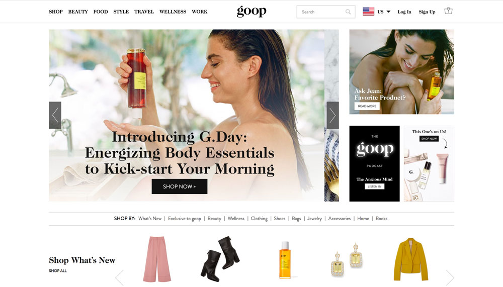
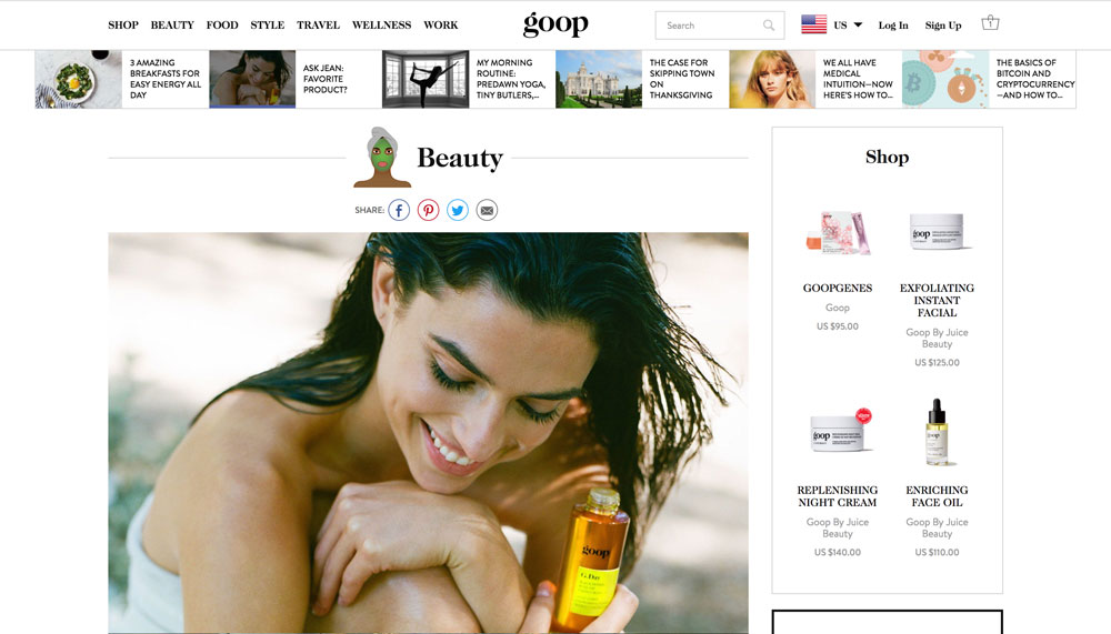
  • Very lifestyle-centric site featuring shopping, beauty, food, style, travel, wellness, and work

  • Large A-spot on the landing page features a story or a sale with a call-to-action button and an enticing photograph

  • Underneath lies a shopping section with an auto-rotating carousel highlighting all the new products on the site and different categories of products to shop by

  • A grid of recent stories lie under the shopping carousel

  • Gwenyth Paltrow’s product picks are presented in another auto-rotating carousel

Hypebeast

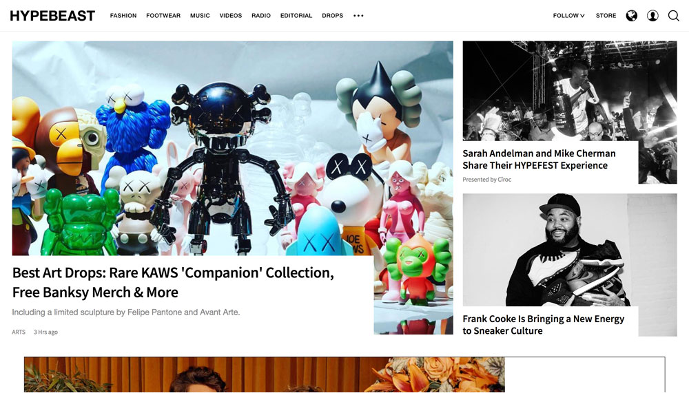
  • A 3-article grid is shown at the top of the landing page with the A-spot story marked with a category (i.e., arts, design, tech) and when it was published

  • Underneath shows the “Most Hyped” stories with the top 5 stories with the most hypes

  • Each top story has a flame icon with the number of hypes – stories with: >20,000 hypes have red flames, >10,000 hypes have yellow flames, and <10,000 hypes have grey flames

  • Stories can be filtered by category on the top navigation bar or by latest, rising, popular, and most commented, which underneath the top, most hyped stories

  • Users can infinitely scroll to see more stories within the latest, rising, popular, and most commented categories
User Interface

Net-a-Porter

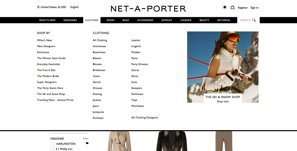
  • There is a wide array of categories at the top of the site: What’s New, Designers, Clothing, Shoes, Bags, Accessories, Jewelry, Lingerie, Beauty, and Editorial

  • Each category has a few sub-categories that drill down to even more sub-types

  • One of the sub-categories is “SHOP BY,” which allows users to navigate beyond the usual item categorization; these include: What’s New, Exclusives, New Designers, Most Wanted, and Runway

  • Users can really hone in on what they’re looking for due to their diverse, comprehensive categorization system

  • Products have tags underneath the price that marks products with tags like: exclusive, seasonal pick

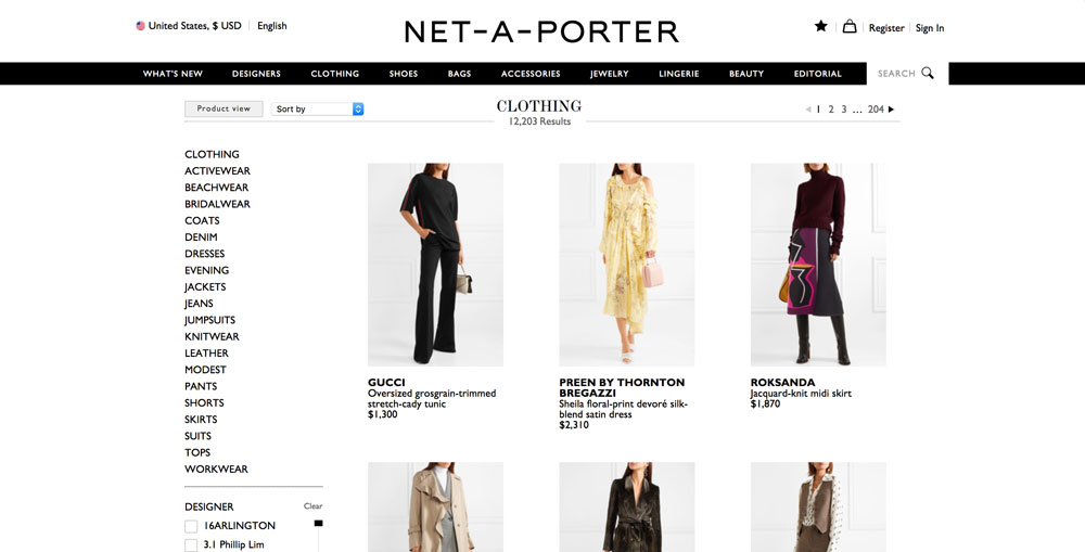
  • “Product View” by default: Products appear alone against a transparent background until a user hovers over it; then, they’ll see the product on a model

  • Users can select “Outfit View” next to the “Sort by” dropdown to see all products on a model; if a user hovers over it, they will see the product alone

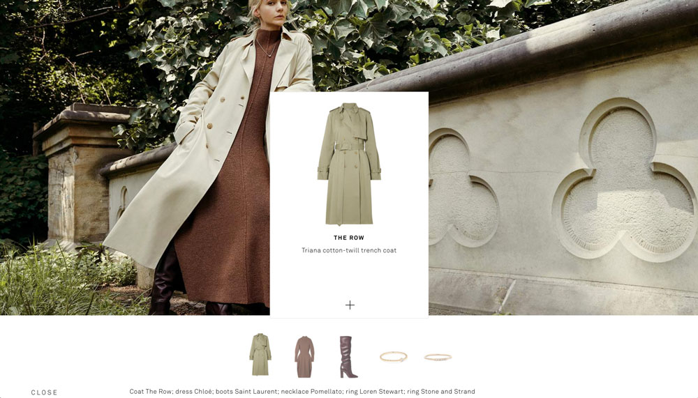
  • Products featured in a story have a really clean UI; they expand to allow users to add it to their cart, wishlist, share, or view product details when users click the “+” button underneath

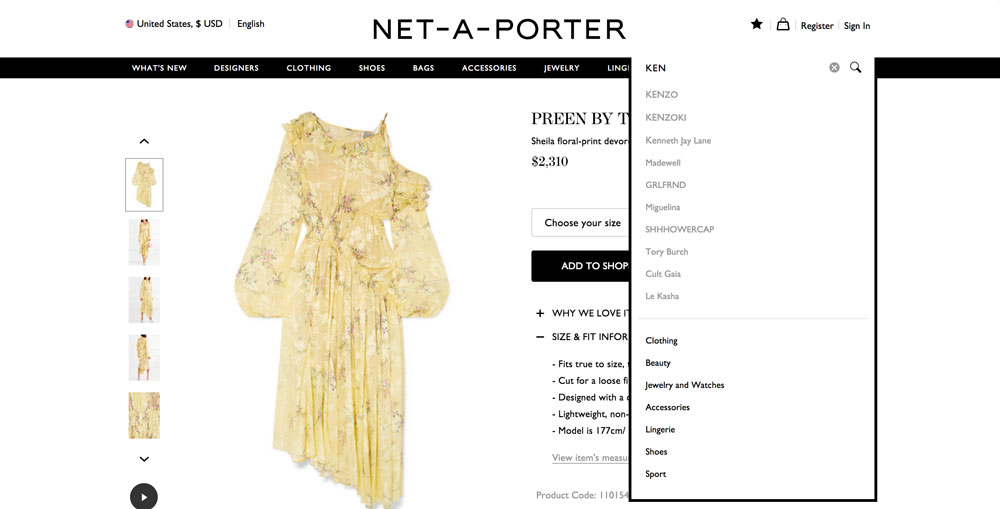
  • As users type in a search query in to the search bar, suggestions appear to help guide the user in their search

  • The search bar also pre-populates main categories for the users to click on to search within a specific category

Matches Fashion

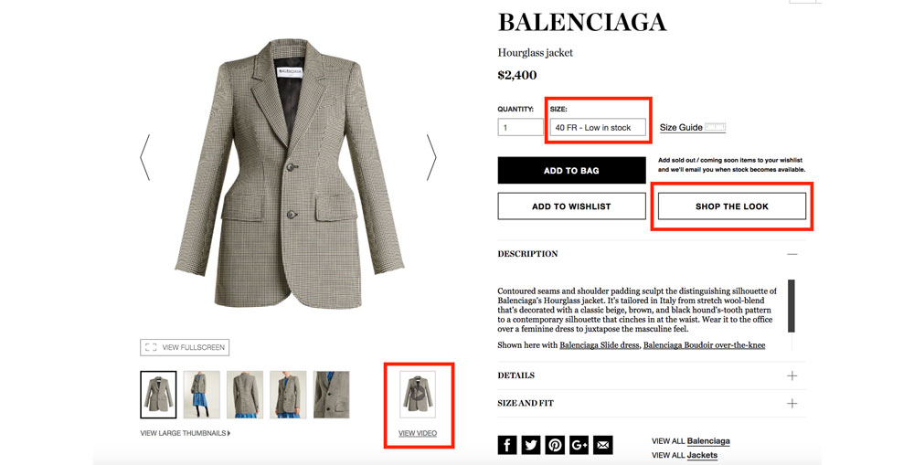
  • Alerts user if a product is low in stock (takes advantage of the scarcity effect)

  • Product page: includes a video of a model wearing and walking in the product

  • “SHOP THE LOOK” button allows you to see all the products the model is wearing

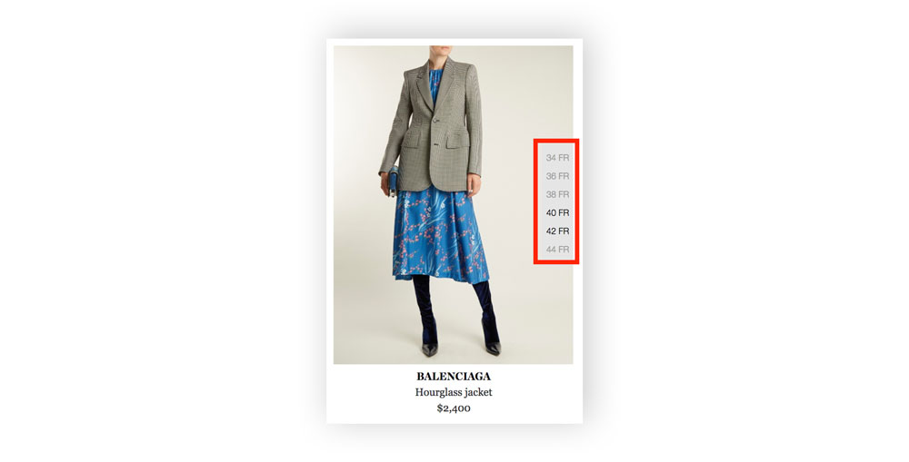
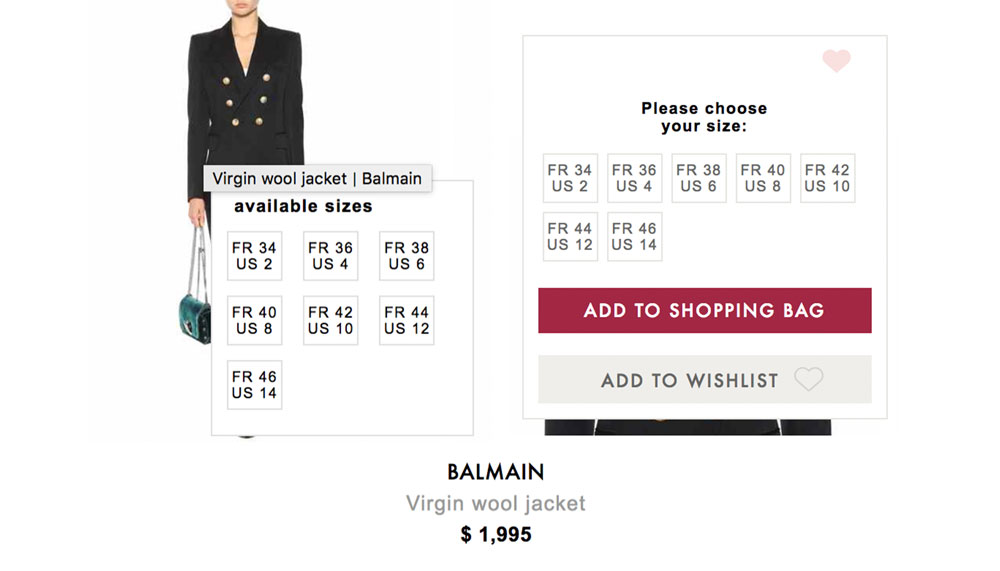
  • Hover over item on product collection page: you can see sizes available and select it to be redirected to product page (don’t need to select size later)

Farfetch

  • Filters by: same day delivery, category, sale discount, designer, color, price, location product is shipping from

  • Tells you if a product is low in stock (creates a sense of urgency, product is in demand)

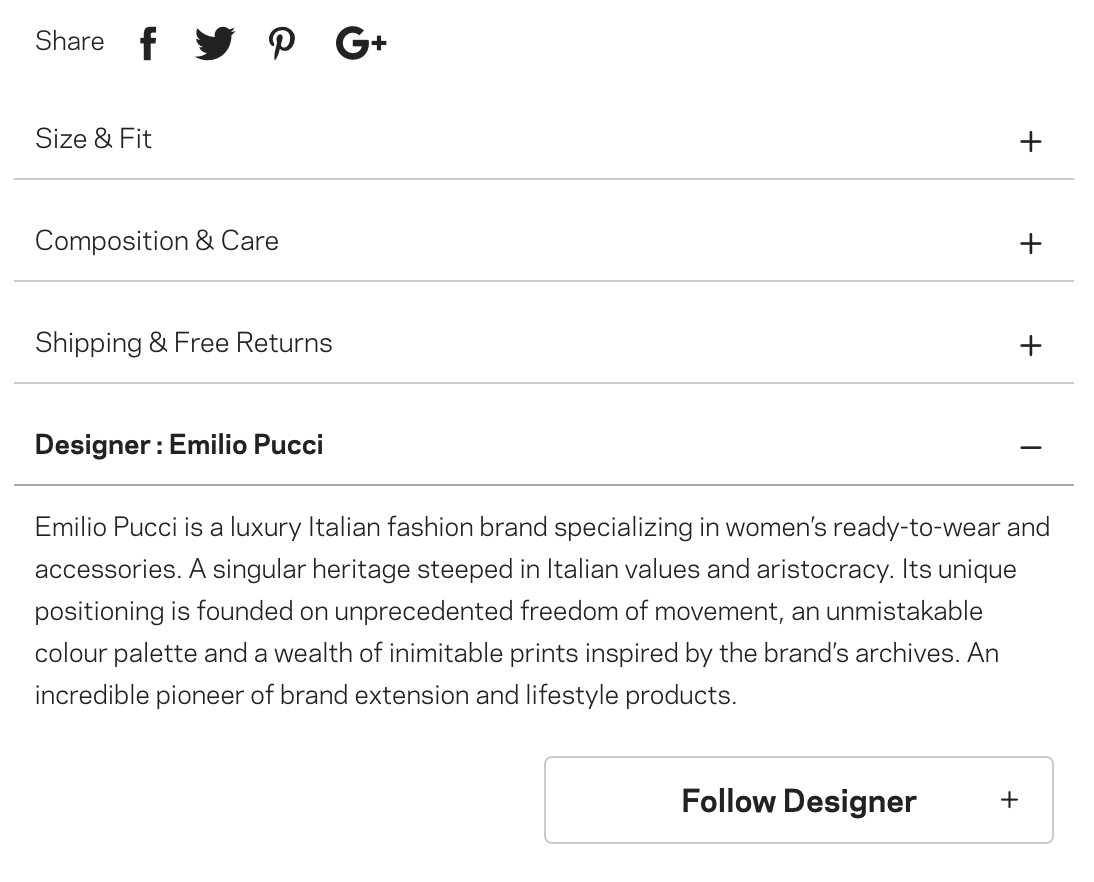
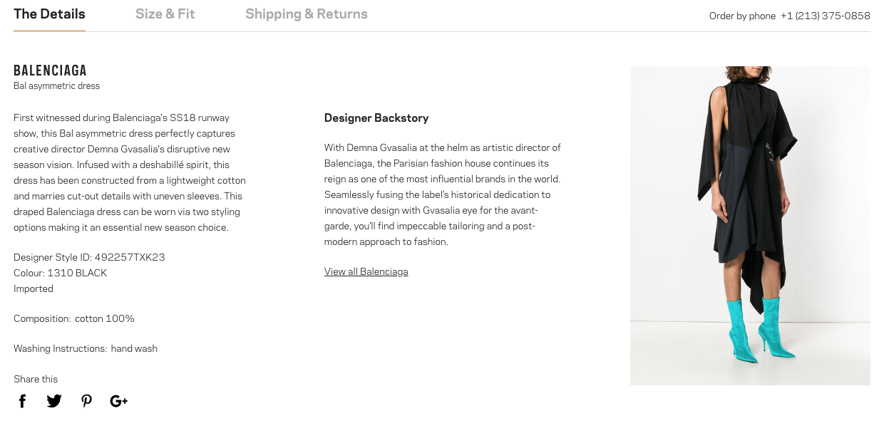
  • Product page: description, size & fit, composition & care, shipping & free returns, designer information (option to follow designer but need to sign up for an account to do so)

MyTheresa

  • Hover over products to see available sizes – improves accessibility so people don’t have to click into product to realize their size is not available

Glossier

  • Hover state over products: cursor changes into a random, fun icon

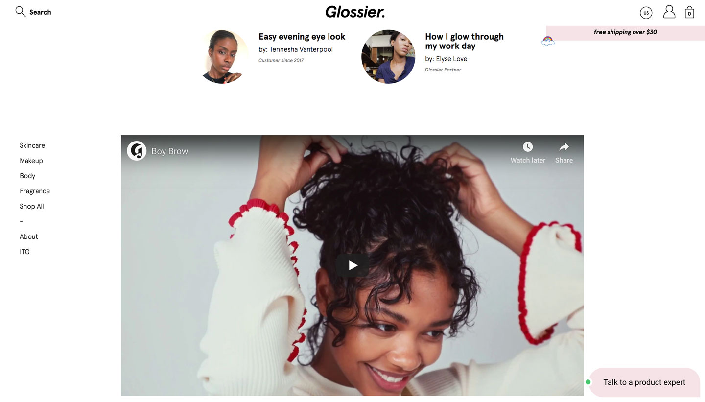
  • Videos show how to use product

  • Ability to filter reviews granularly to match user preferences

  • There is a breakdown for each product: “What is it?”, “How to Use”, “Benefits”, and “Key Ingredients”

  • Benefits listed for each product has fun icons to accompany the type of benefit (i.e, water resistant is shown with an umbrella icon)

  • Before and after pictures of using the product are shown on the product page

  • Adding products to your shopping bag will open up a panel from the left side of the page showing what’s in your bag along with an easy checkout button

ITG - Into the Gloss

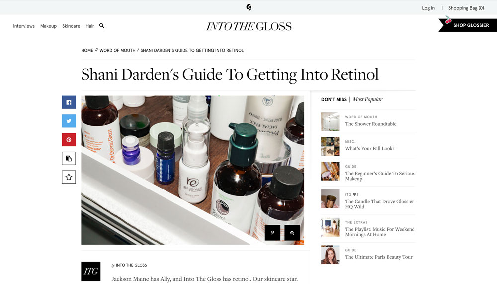
  • Side bar on right telling you which are the most popular stories to not miss

  • At bottom: tells you to sign up to get ITG’s best stories and updates delivered right to inbox

  • Hover over image in gallery: a bar appears to tell you what brand the products are from

  • Shop Glossier button on the top right of every page - links you to Glossier website

    • Hover over products on a product collection page: the cursor becomes a random, fun icon

    • Click on product: tells you what’s inside, how to use, attributes, reviews & ratings

    • Filter reviews based on skin type, age range, skin tint shade

    • Sort reviews based most recent, most helpful, highest/lowest rated, oldest

    • Rate how helpful reviews were

  • Shopping bag panel pops up on the right hand side every time you add an item

Man Repeller

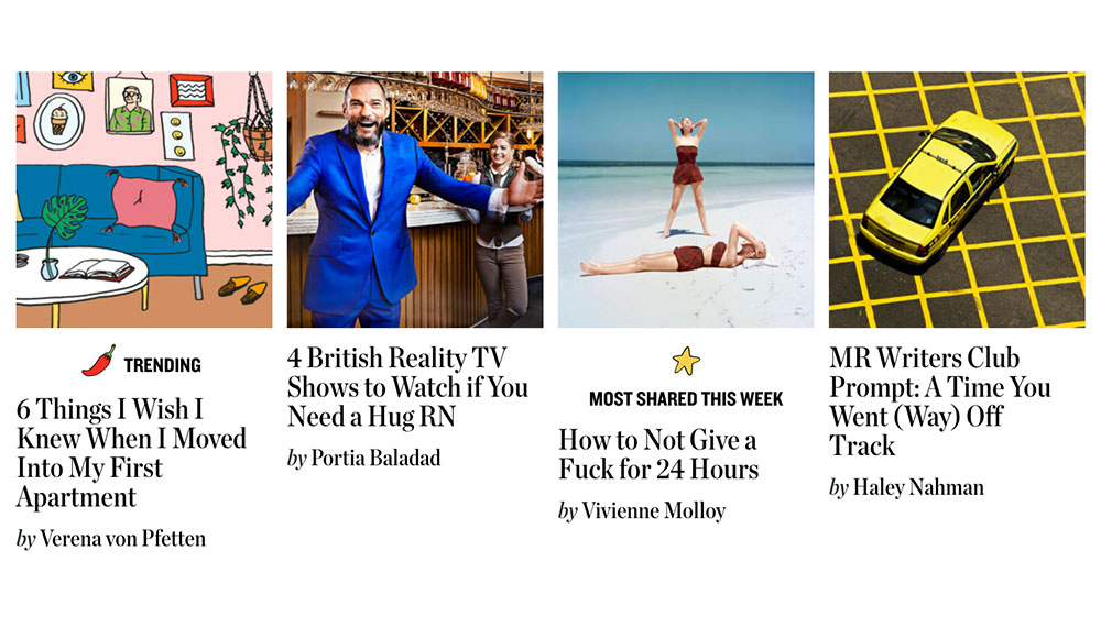
  • Stories on the landing page are marked with icons

    • Red hot pepper: trending, star: most shared this week

Houzz

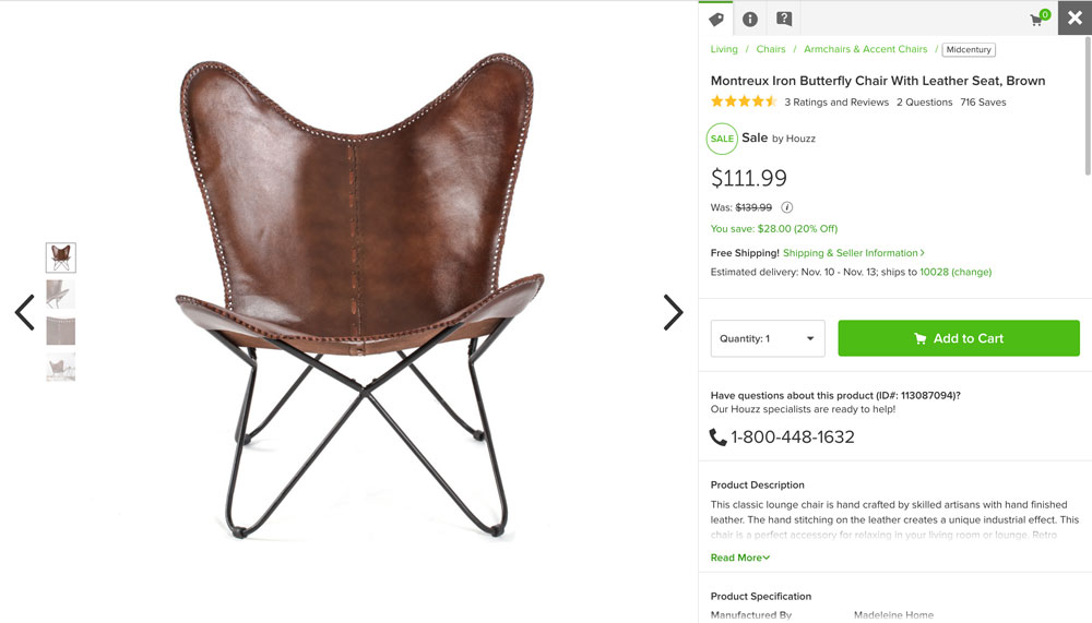
  • Giant “SALE” button at the top navigation bar

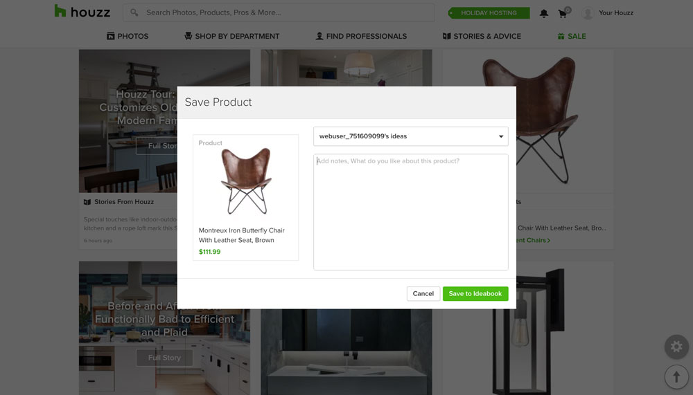
  • Overlay or giant preview opens when you click on a product → allows the user to exit easily by clicking the “X” on the top right; this prevents the user from losing the card they were on

    • Uses a clickable tab format for product information meanwhile all information is on one page and is scrollable

Saves & Wishlists

Lyst

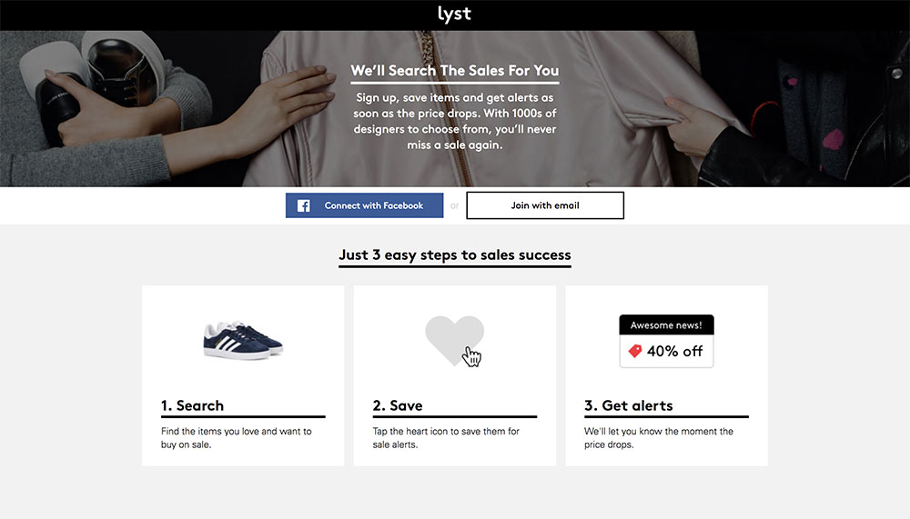
  • Clicking the heart next to every item will allow users to get alerts if the item goes on sale

  • Users can save items by clicking on the heart next to every product

  • Saving an item will also subscribe a user to alerts if those items go on sale

MyTheresa

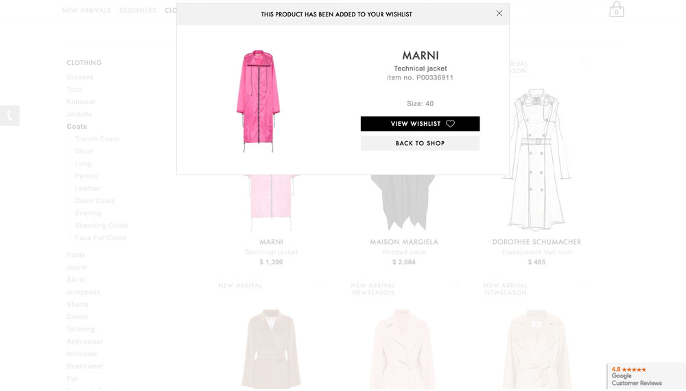
  • Add items to wishlist by clicking on the heart on the top right corner

  • Prompts you to select size and add

  • Alert system - if you create an account, you can configure alerts to notify you as soon as the items become on sale, go down to only one left, or have come back into stock

ITG - Into the Gloss

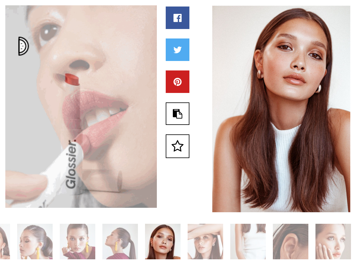
  • Share stories via Facebook, Twitter, Pinterest

  • A COPY button to copy link

  • These icons are under the image gallery in the story and also on the left side of the gallery or image

Houzz

  • Save photos: require signup or login

  • Email photos: creates an account for you when you input email

  • Account can be linked to Google or Facebook

  • Bookmarking stories require account signup

Food52

  • Users can “heart” an item but they must sign up

  • Items can be saved to a user’s collection

    • Users can name their own collections or save items into their pre-named collections

Recommendations

Net-a-Porter

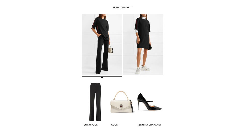
  • “HOW TO WEAR IT” gives users options to style the item with other items that complete the outfit

  • “YOU MAY ALSO LIKE” shows similar options to the item a user is currently looking at

Matches Fashion

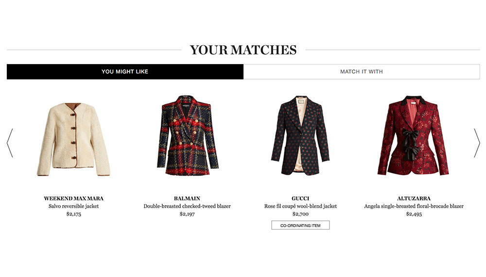
  • Includes “YOU MIGHT LIKE” and “MATCH IT WITH”

  • “MATCH IT WITH” gives you options to complete your outfit but is largely based on what the model is wearing

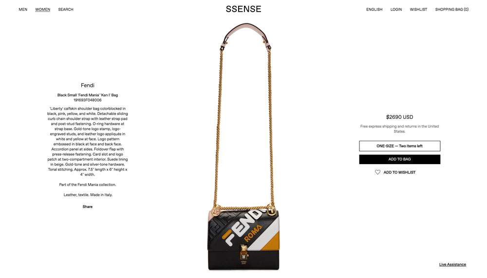
SSENSE

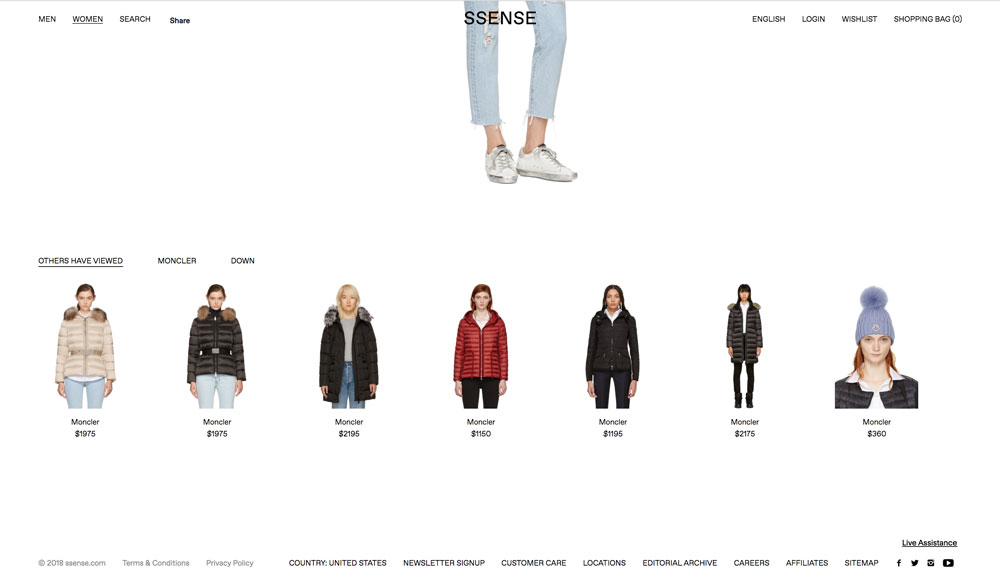
  • Shows other products worn by the model in the photo

  • Recommends other products from the same brand as the product being viewed and other products of the same type from other brands

  • Other products that users who’ve clicked into the product have viewed are shown as well

Goop

  • “You May Also Like” – similar, recommended stories lie at the bottom of each piece

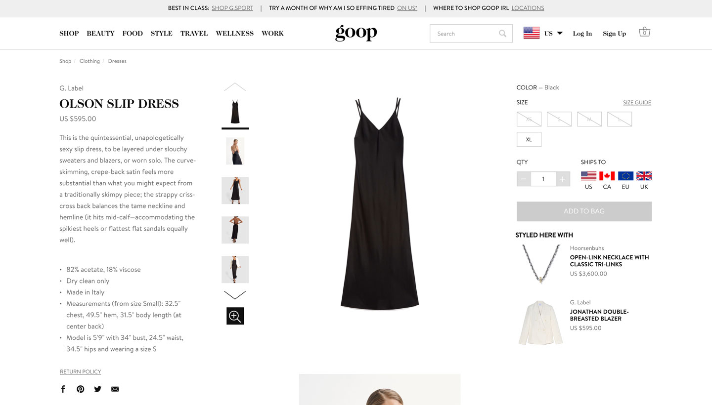
  • Users get product recommendations based on what the model is wearing (“Styled Here With”), similar items of the same type, and other products by the same brand

Houzz

  • Product page: suggests related products, people who liked this also liked, visually similar products, recently viewed and recommendations, customer reviews & questions

  • Similar stories (People who liked this story also liked) on right hand sidebar

  • Shop related categories on right hand sidebar
Editorial

Net-a-Porter

  • Each story on the landing page has a “Read & shop” button under the sub-headline

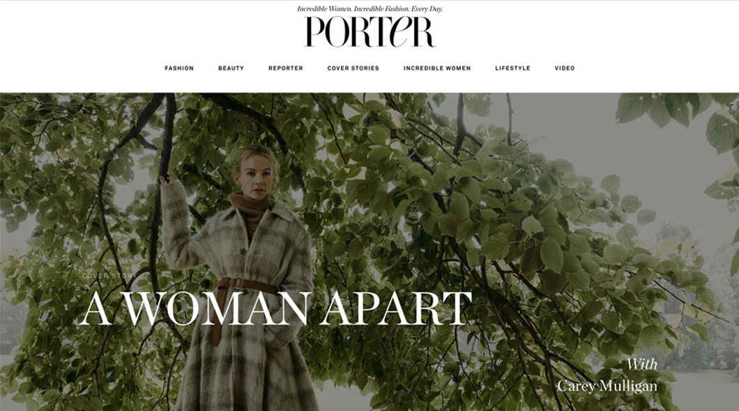
  • Cover stories are based on PORTER, their magazine, and the online editorial is very clean with a magazine aesthetic

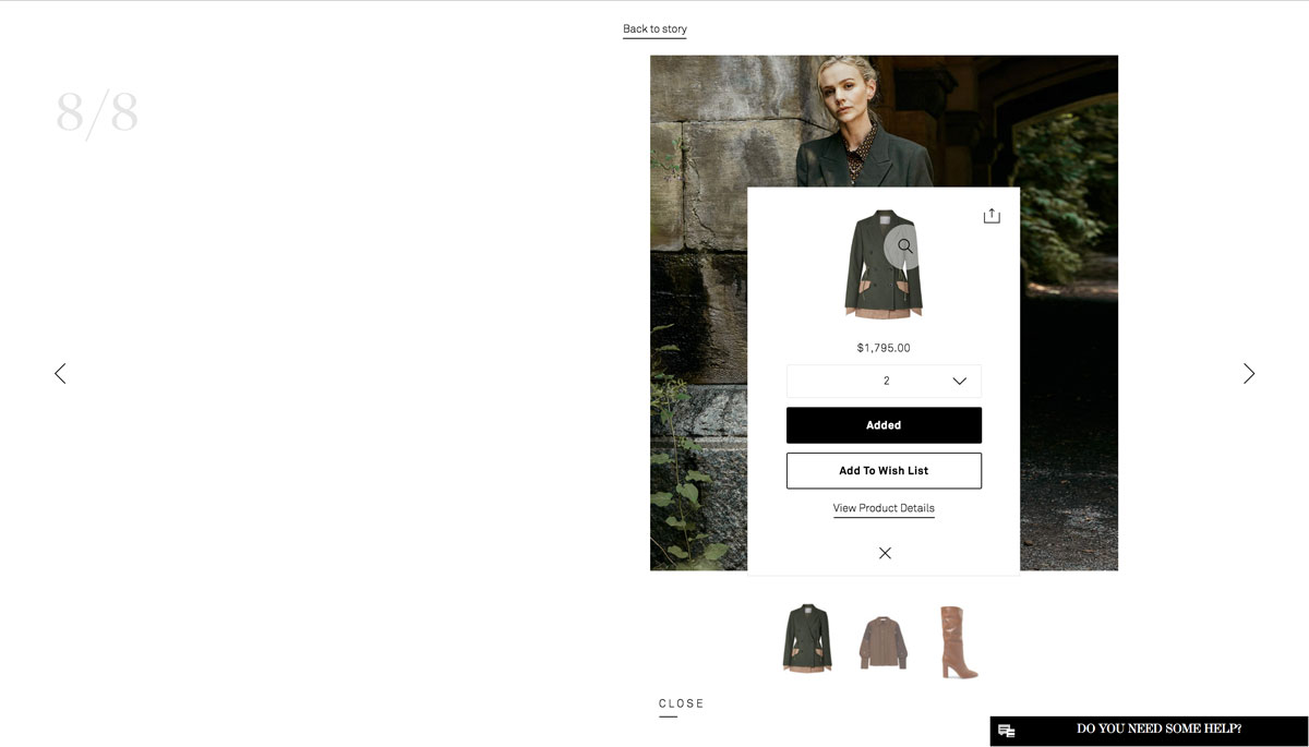
  • Clicking on images in the cover story launches a gallery and under each image is a “Shop the Look” section that allows users to browse the items the featured model is wearing

  • Users can add the features products directly to their shopping cart or wishlist from the gallery view, or go to the product page

  • There are also share features (Facebook, Twitter, Pinterest, e-mail) at the top right corner of each product featured

  • The story can be shared as well with a clean button that opens up Facebook, Twitter, Pinterest, and e-mail icons

SSENSE

  • Stories have a similar layout to blogs

  • They are photograph-forward with juxtaposed text that serves to tell a user what is important to read (either by flushing the full length of the page or by different typeface and font size)

  • Underneath the photographs, at the bottom left corner, can tell a user what a model in the photograph is wearing

  • Photographs are generally much larger than the text and are vibrant

ITG - Into the Gloss

  • Stories are very blog-like

  • There is a gallery at the top of the page followed by blocks of text

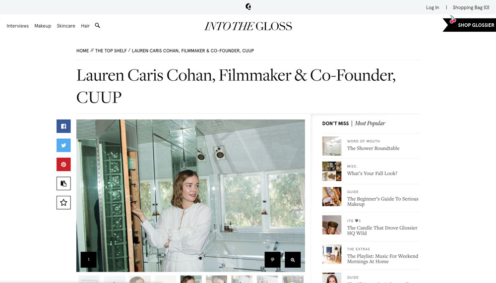
  • Users are encouraged to share the stories with the icons (Facebook, Twitter, Pinterest, Copy Link, Star) located on the left of the galleries

  • Stories are categorized: Guide, Word of Mouth, Misc., ITG Loves, The Extras, The Top Shelf, The Top Shelf After Dark, The Face, Makeup Ideas, The Technique, Glossier HQ

Hypebeast

  • Stories are generally short and feature videos, audio, and photographs at the top of the page

  • Users are able to comment on the stories at the bottom of the page

  • Stories are tagged

  • Users can also react to the stories via emoticons underneath the tags

  • Recommended stories live underneath the comments

  • Users can see the number of hypes a story received under the share icons

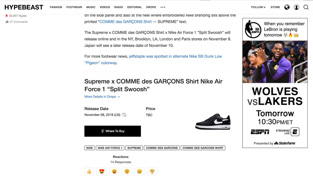
  • Stories featuring products have a “Where to Buy” button that links users out to another site or product page

    • They may also include release date and price if an item is brand new

Goop

  • Stories cover a wide array of holistic lifestyle categories: Beauty, Food, Style, Travel, Wellness, and Work

  • Some stories are very visual; there are not only photographs, but there are images of products that overlay the photographs as well

  • Recommended stories live underneath the story selected

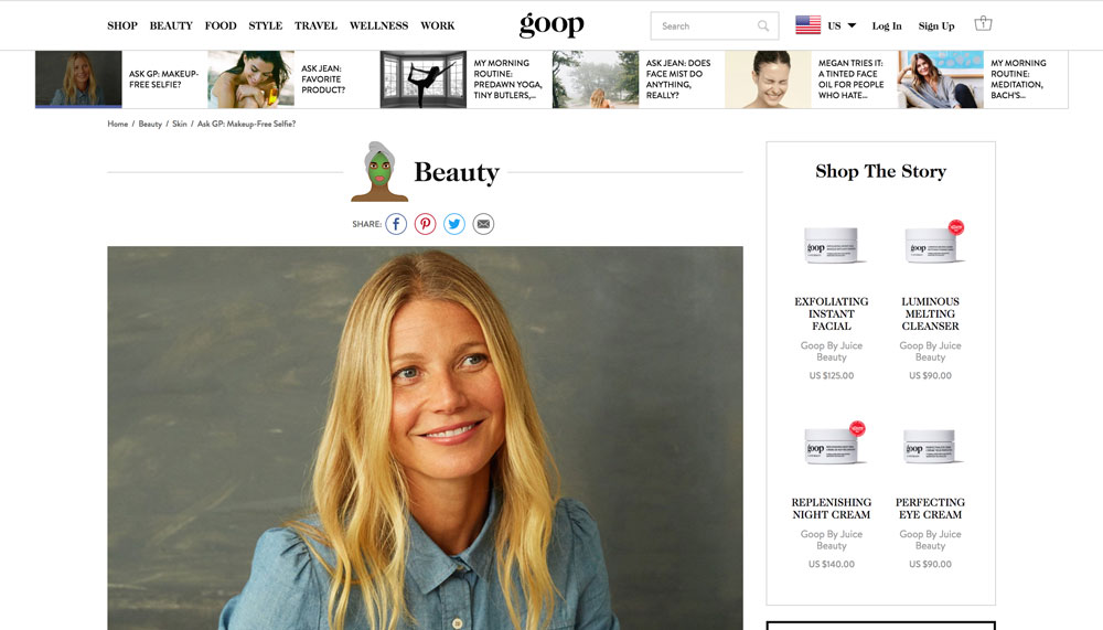
  • To the right of the story can live a box titled “Shop The Story” and users can see products mentioned in the piece

  • Clicking on the products in “Shop The Story” will bring the user to the product page on Goop

  • Some stories can load more stories when a user keeps scrolling after the end of the initial story

  • Stories in the Wellness and Travel category can be very text-heavy

Houzz

  • Stories are categorized very well: Latest from Houzz, Most Popular, Houzz Tours, Kitchen Design, Bathroom Design, Decorating Guides, More Rooms, Remodeling Guides, Architecture, Landscape Design, Gardening Guides, Working With Pros, Your First House, Fun Houzz, and Life

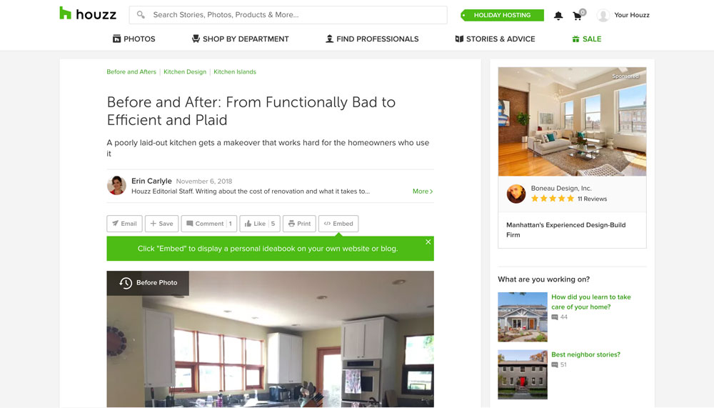
  • Stories provide many suggestions on the right side of the page: Shop Related Categories, Related Products, and Sponsored Products

  • Users can comment on stories

  • Recommended related stories live underneath the comments

  • Users are encouraged to interact and share the story with social buttons: E-mail, Save, Comment, Like, Print, Embed

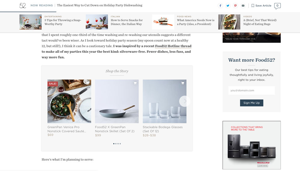
Food52

  • Many products are promoted in the stories

  • Videos can appear in the stories

  • Users can click on photos in the stories to be linked out to the product pages on Food52

  • As users scroll down on the stories, a bar appears to show users trending stories

  • Users can comment at the bottom of the page

  • Share icons live at the top of the story to encourage users to send it to their friends via Facebook, Twitter, Pinterest, or e-mail

Special Features

Net-a-Porter

  • Users are able to add products to their shopping cart or wishlist directly from the gallery view of the story

  • Editorial is formatted like a magazine and highlights their magazine, PORTER

  • Top navigation bar is categorized thoroughly with specific subcategories and even more subtypes
  • Users can personalize how they want to view the products: product view or outfit view

Matches Fashion

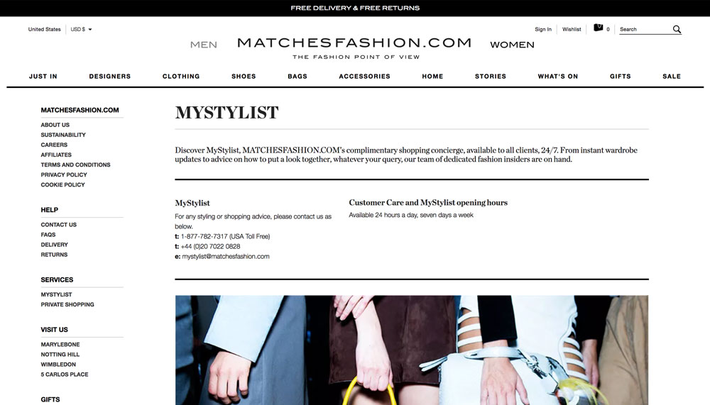
  • MyStylist - 24/7 complimentary shopping concierge to give you advice and answer your questions

SSENSE

  • Sale products show the original price and lets users know how many percent they are saving

  • Stories and editorials are very magazine-like with quotes and full-length photography

  • Stories and editorials also have text that link out to brands and their products on SSENSE

  • “Live Assistance” is available at the bottom right corner to help users with their shopping experience

  • Selecting a size shows users the exact number of products in that size are left

Glossier

  • Users can leave reviews and ratings for the products and read others’ reviews

  • Some Glossier products have videos with people demonstrating how to use the product (how-to videos)

HBX

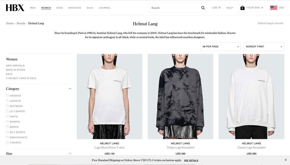
  • Each product highlights the brand it’s from and above the product link is the link to the brand page on HBX

  • Each brand page has an enticing description about the brand

  • Users can see older products in the “Archive” section of the top navigation bar

  • Users can read short, photography-based pieces in the “Journal” section of the top navigation bar that mostly highlight products in the site

  • Hovering over a product in the grid view of a collection shows a different view of the product without having to make users click into a product

Goop

  • Each lifestyle category has its own sub-categories with an abundance of articles for users to peruse
  • Shopping is integrated seamlessly with the stories - each story page has a right hand side panel with either an advertisement or a “Shop” section showing products featured in the story
  • Hovering over a product allows users to see a model wearing the product so they can gauge fit without clicking into a product

  • Adding items to one’s bag will open up a side panel to show users their cart and allow them to easily check out with call-to-action buttons

  • Users can shop a vast variety of curated products on this site: beauty, clothing, shoes, bags, jewelry, wellness products, accessories, home goods, and books

Houzz

  • Houzz TV: features prominent public figures

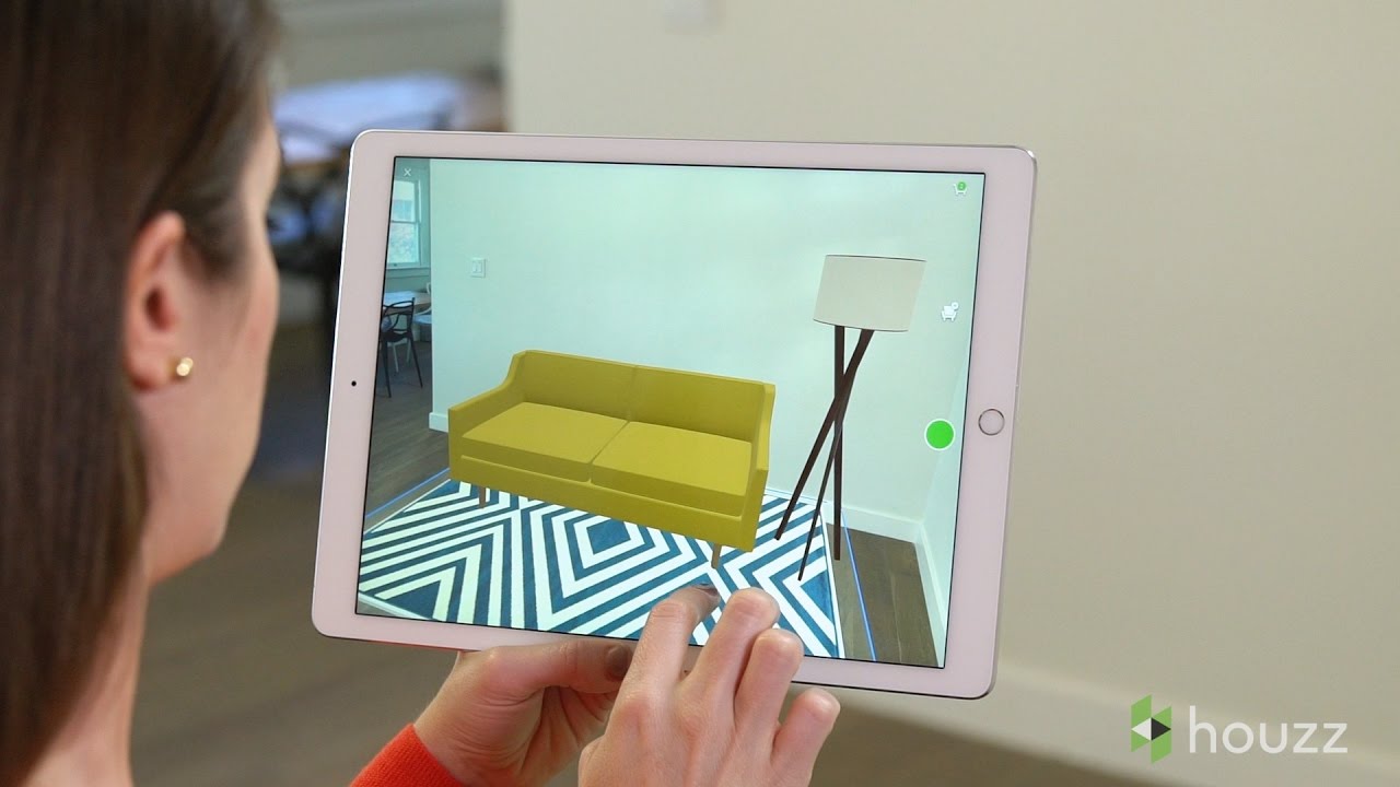
  • Houzz app for iPhone/iPad with 3D preview

    • Allows user to see how a product would look in their space; enables user to scale product to size and get a sense of how multiple products work together in a room

    • Feature available for over 300k products on Houzz

    • There is a 3D filter when searching for items

    • Launches your device’s camera to take a picture of your space

Social Integration

Net-a-Porter

  • Each story has a share button the expands to the social icons (Facebook, Twitter, Pinterest, e-mail) on the right hand side under the story date

  • Products featured in each story have a share button at the top right corner of the product box; it expands to the social icons as well

ITG - Into the Gloss

  • Open thread discussion to engage users

  • There is a box showing how many replies are on the thread

Hypebeast

  • Each article shows social icons under the article title and at the bottom of the article; they allow users to share the articles on: Facebook, Twitter, Reddit, Pinterest, Pocket, or e-mail

  • Users can see how many hypes an article received to gauge its popularity with the rest of the online community

  • Users can follow Hypebeast on various social media platforms: Facebook, Instagram, YouTube, Twitter, Snapchat, or Flipboard

  • Users can sign up for their newsletter to get instant updates and exclusive deals

  • Users can comment on the articles and read other users’ comments as well

Houzz

  • “Embed” button on content pages allow you to share story on your own website or blog

  • Stories and advice: discussion pages where users can post questions, show before and after renovation photos, host polls
  • You can see how many times the item was added to ideabooks

  • Houzz ideabook: a place where you can store ideas, save your favorite home design photos and product shots, notes, PDFs and other details of your home project

  • Able to share it with other people (set private, public), email it to people to collaborate

  • Followers allow you to keep up with other users

Food52

  • Recipe contests: Contest finalists, Community Picks, and Wildcard Winners get prime placement in our recipe search and are likely to be featured in future books and apps

  • Collections can be followed (although you must sign up for an account)

  • At the bottom of stories and products are hearts with the number of likes and comments (allows you to see how much engagement a product or story is getting)